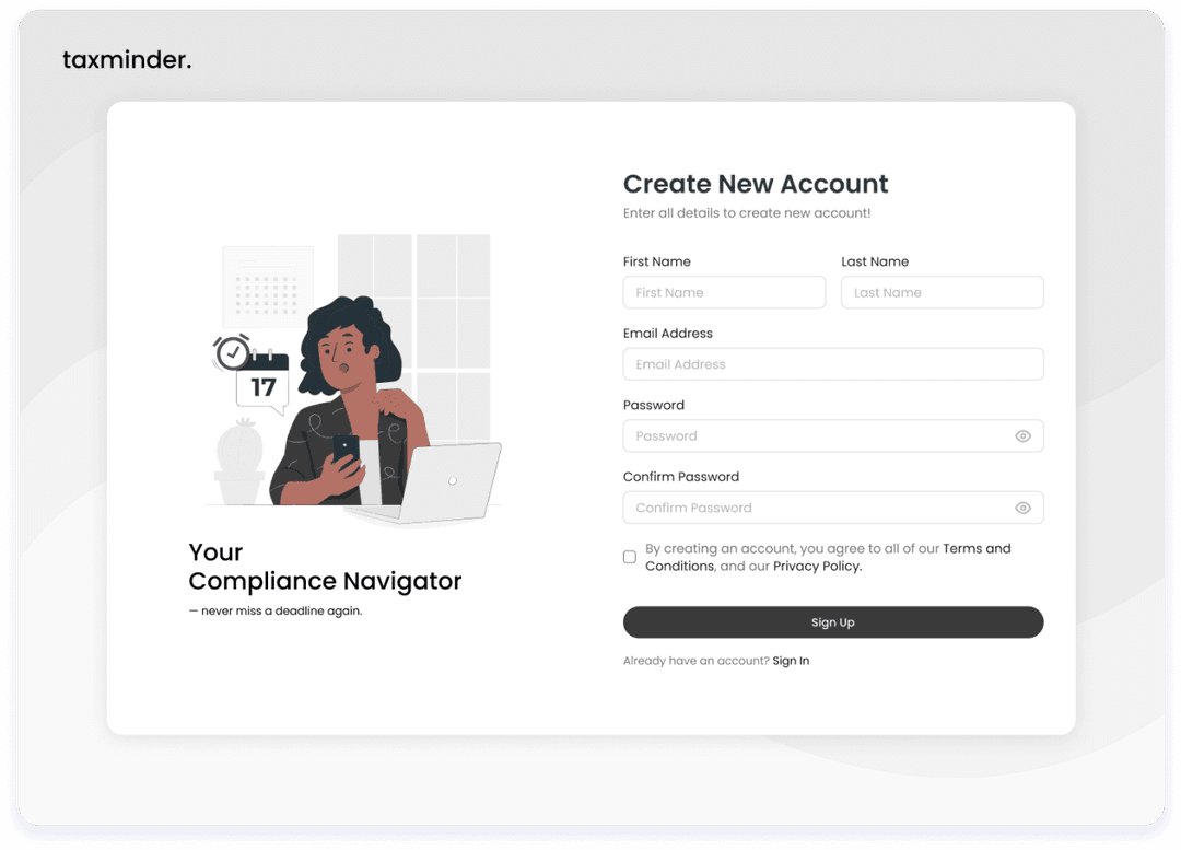
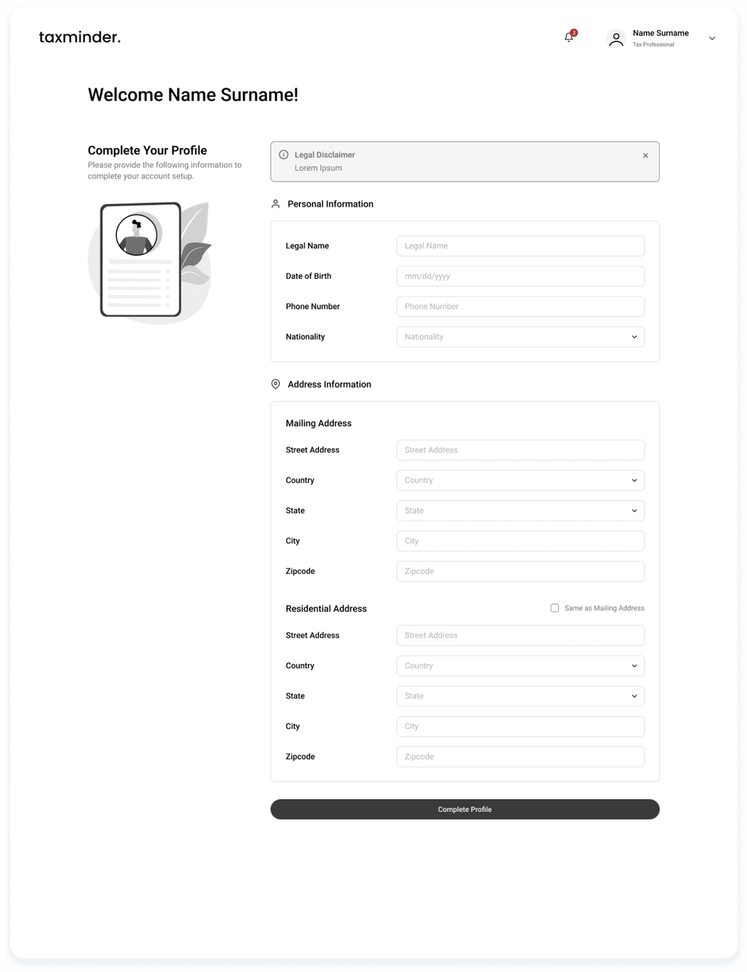
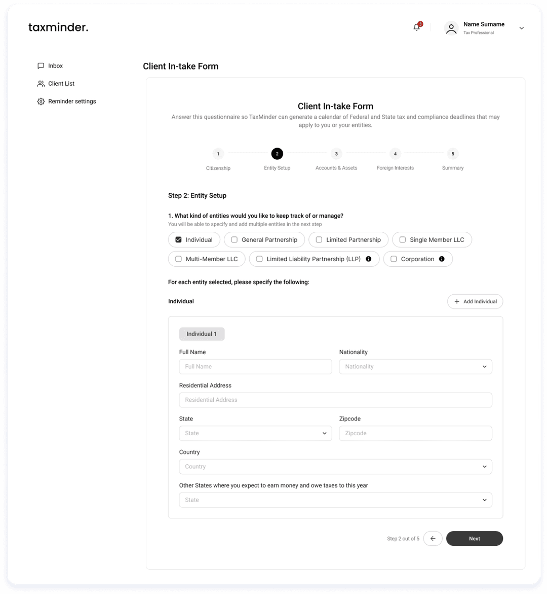
TaxMinder

Role: UI/UX Designer

Platform: Website

Duration: 2 Weeks

Year: 2025

Tool: Figma

Project Overview

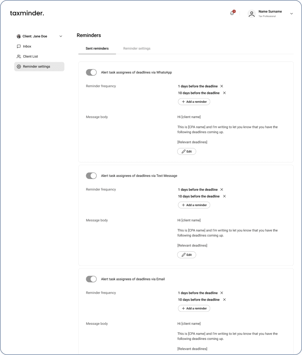
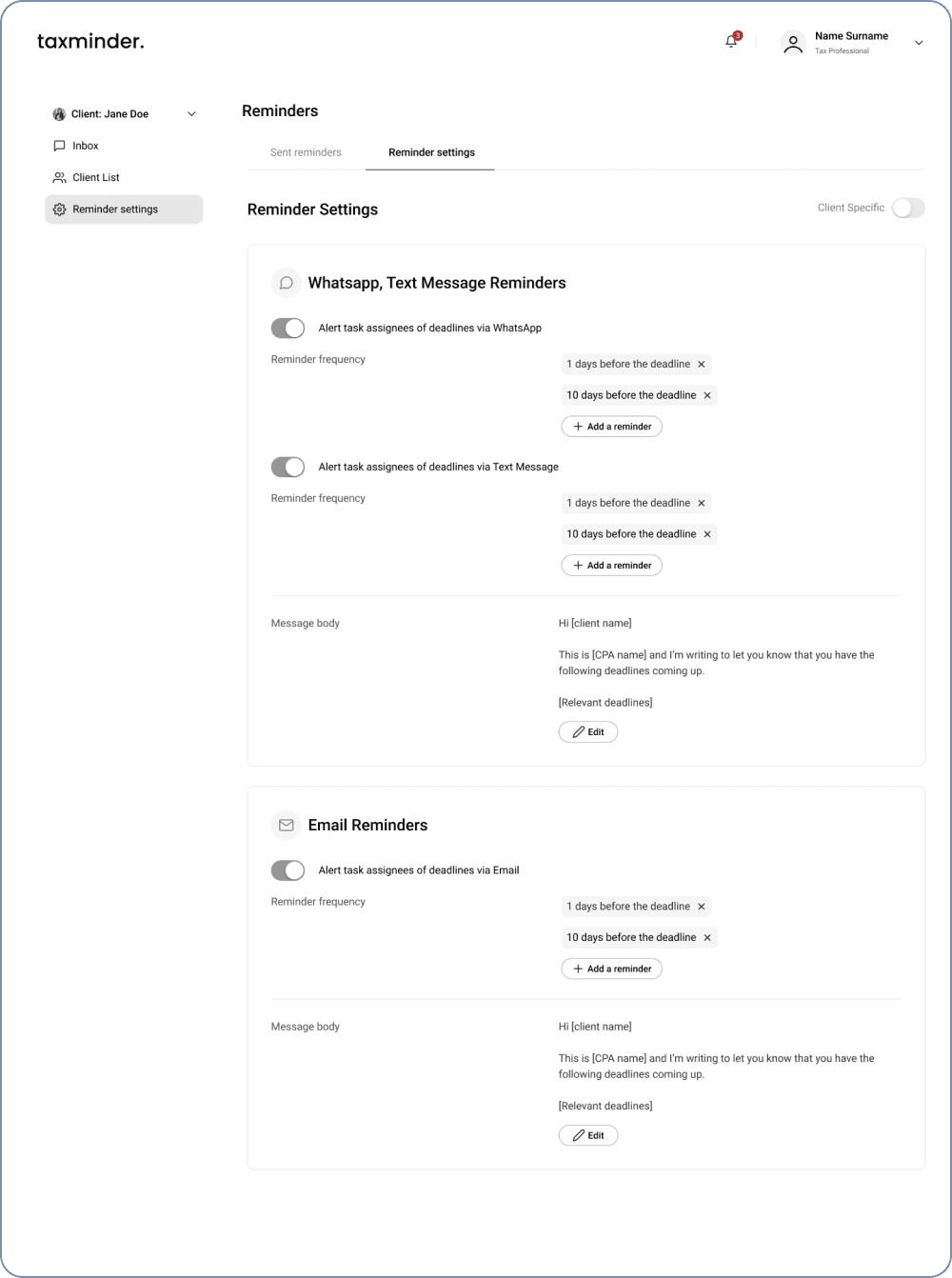
TaxMinder is a web-based tool that helps users primarily individuals and businesses in the US stay on top of tax and compliance deadlines. It generates a personalized calendar based on the user's filing information and sends automated reminders to ensure timely compliance. The goal is to streamline collaboration with tax professionals and reduce the stress of missing critical deadlines.

Objective

To design a clean, intuitive interface that allows individuals and tax professionals to efficiently gather, submit, and manage compliance information starting with a structured client intake form that feeds directly into the calendar generation logic.

My Role

  • Collaborated with another designer.
  • Took over the project after the initial wireframes were completed by the first designer.
  • Focused on client onboarding and account setup workflows, including client intake form, registration, profile account settings, and instant messaging.

Design Process

Understanding the Hand-off

Template Analysis & Information Structuring

Low–Fidelity Wireframes

Collaborative Reviews

1

Reviewed existing wireframes for the tax calendar, entity management, and reminders. Identified design patterns and UX principles already in use.

2

Broke down a detailed intake questionnaire provided by the client. Grouped questions into logical sections for a multi-step experience.

3

Maintained a neutral, clean design to adapt easily once brand guidelines are introduced.

4

Conducted walkthroughs with the team to align on usability, logic, and future extensibility.

Reminder Settings Design Revision

During the project, I was assigned to revise and improve an existing design for the Reminder Settings page, originally created by the other designer on the team.

content 1

The Feedback

Client raised key concerns about the original layout:


The layout felt repetitive and visually long-winded, especially for similar message types (WhatsApp, Text, Email).

Lack of clear visual separation or indicators made it harder to distinguish between reminder types.

Suggested that WhatsApp and Text Message could share a single message body due to their similarity in length and format, while Email could remain separate.

Original Design

Each message type (WhatsApp, SMS, Email) shown in full separately, causing visual repetition.

Original Design

Improved Design

  • Grouped WhatsApp and Text into one section, introduced section titles/icons, and simplified the structure while maintaining message customization.
  • Grouped WhatsApp and Text Message reminders into a shared section with a single message body field, reducing redundancy.
  • Introduced clear section headers and icons to help users distinguish each type of reminder visually.
  • Preserved flexibility by keeping reminder frequency editable per channel.
  • Added a “Client Specific” toggle to future-proof the design for more personalized reminder settings.
  • Streamlined the layout for better scan ability and ease of use, especially for busy professionals managing multiple clients.
Original Design

Translating Intake Requirements into Functional UI

As part of the onboarding flow for TaxMinder, I was tasked with designing the Client Intake Form, which plays a central role in generating a user’s personalized tax calendar. The intake form questions and logic were fully provided by the client. My role was to translate this complex, tax-heavy document into a clean, user-friendly form that supports dynamic input and scales with future needs.

The Challenge

I was provided with a detailed intake document from the client, outlining various entity types, financial accounts, real estates, foreign interests and their associated data fields. The goal was to translate this raw content into a structured, user-friendly interface that users would complete after registering for an account.

Snippet of intake document

Snippet of intake document

My Design Approach: Client In-take Form

Multi-step flow

I broke down the lengthy intake into 5 clear steps to reduce overwhelm and guide users through the process gradually.

Clean, minimal layout

Prioritized whitespace and readability to maintain user focus, even in data-heavy sections.

Dynamic forms

Designed reusable, expandable components that respond to user selections (e.g., selecting multiple entity types).

Legal transparency

Included disclaimers and user acknowledgment where needed to clarify TaxMinder's role and limitations.

Client In-take Form Design

Client In-take Form

View Figma for more detailed view on in-take form

Mockup screens

As part of the end-to-end user experience design for TaxMinder, I designed several essential screens to support account creation, onboarding, and user management.

Sign Up

Sign Up Screen

Post registration account setup

Post registration account setup

Client In-Take Form

Client In-Take Form

Sign In

Sign In Screen

User Profile

User Profile Details

Instant Messaging

Instant Messaging Interface

View More in Figma

Want to explore more screens?

Key Achievements

  • Successfully translated complex client intake requirements into a step-by-step guided form.
  • Improved onboarding efficiency by structuring a minimal account setup that gathers only what's necessary.

Reflections

This project highlighted the importance of clarity and simplicity when dealing with complex topics like tax compliance. I strengthened my ability to design guided, user-friendly flows, especially for onboarding and data collection. Given more time, I’d initiate usability testing with real users to validate and fine-tune the flows.

Overall, this was a valuable collaborative experience that sharpened my problem-solving skills and reinforced the importance of adaptability in projects that evolve without finalized branding or visuals.

Check out other works